This is my philosophy statement from History and Philosophy of Design this semester. I really liked the way it turned out. Maybe someday it might even become a piece for my portfolio. Here it is:
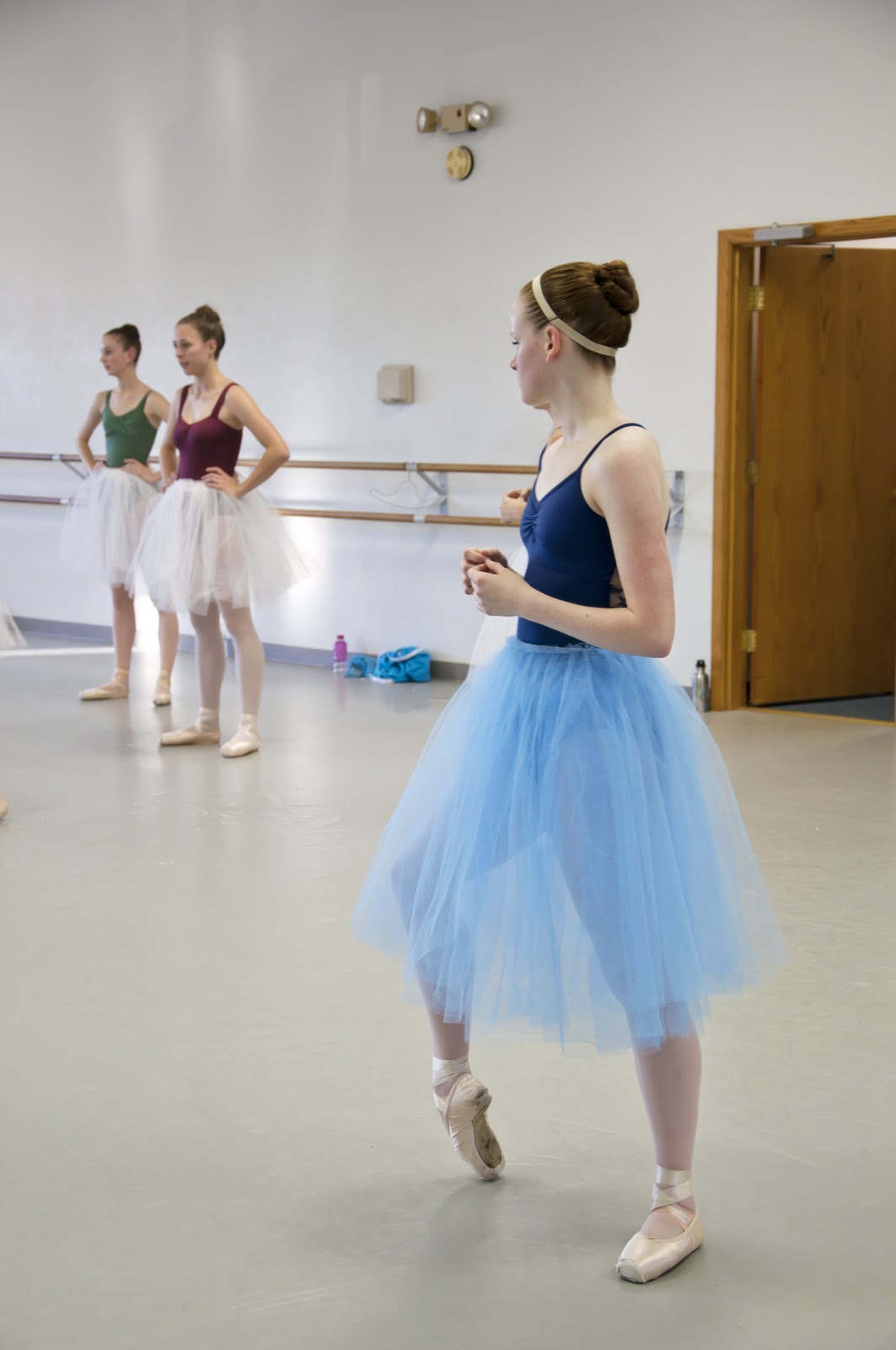
Photography is my way of seeing the world around me, my looking glass. Through my camera's lens, I can capture specific scenes that are important to me, that I want to remember, or that impact me in a profound way. As I have fallen in love with photography as a medium, I have decided to pursue a career as a photojournalist. For this medium, I value variety and diversity in my work, while still staying consistent in style. I value simplicity in every photograph and the impact, social or personal, that each should make. Most of all, I value honesty and truthfulness in my photographs because this, I believe, is the foundation of all photojournalistic work. These values represent the way that I have viewed my education in photography so far, and will someday form my philosophy as a professional in the photojournalism field.
Variety is vital in photography. It helps to keep my work interesting, as well as keep me interested and invested in my work. It is imperative to find diverse ways of representing the same subject. The problem with photography as a medium is that seemingly everything has been photographed. The challenge for photographers, and what sets the mediocre artists apart from the great ones, is to find a new and exciting way of capturing any subject. By valuing variety and diversity in my photographs, I will hopefully create an entirely new piece of art in each photograph that is different from anything seen before.
This may seem to contradict my need for variety, but I think that a consistency is essential to a photographer’s work, no matter what the subject matter may be. Consistency will help build my own personal style in my artwork. It will form my identity as an artist and it will continually set me apart from other photographers. Because of this, variety and consistency form equally important parts of my philosophy as a photojournalist.
All photographs should be simple. Even the simplest images can convey many layers of information and meaning. If a photograph gets too complicated or crowded, the meaning and message of the piece of art will be foggy or completely lost. I believe that this stylistic value comes from my love of the deadpan style of photography, which lacks expression and is very straightforward in representation. I do not think that my style is exactly like that of a deadpan photographer, but I do think that the simple and clear-cut expression of an idea can give way to more complex thoughts and understanding of an image.
Through this simple style, I believe that I can create impactful work. In my opinion, all photographs should have some kind of impact on the viewer, whether it conveys an overarching social message or they connect with the image on a personal level. The impact of a photograph gives the piece meaning and a reason for existence. Without an impact, a photograph will not be appreciated or understood for what it conveys. Also, it will further convey my personal values and beliefs in my photographs. Personal investment in a body of work will make the photographs more clear and exciting. If I am completely invested, I think that I can create my best and most impactful work.
Most importantly, I think that all photography should be honest. This is especially important in the field of photojournalism because the audience expects and needs the image to be truthful. I think that photography should represent the information or scene in the most realistic way possible. I want to emulate the work of documentary photographers such as Lewis Hine or Dorthea Lange in this way. They represent entirely realistic scenes in their photography, which create incredibly impactful and memorable images. Their photographs have become iconic representations of a specific time period or social movement. They were only able to accomplish this impact through truthful and real images. For this reason, I believe that image manipulation should only be used in small amounts and only to enhance the understanding of the image, not change it completely. It is unfair to use software to make the photograph represent something that it actually does not. Because of the nature of the medium itself, the audience expects the image to be completely truthful; they expect a photograph to represent an actual moment in time. I think that manipulating an image beyond recognition is taking away the truthful and honest qualities that are deeply embedded in photography as an art form. Honest work is incredibly important to me and especially to my integrity as a photographer.
As a student of photography and a future photojournalist, I believe that diversity, consistency, simplicity, honesty and an impact are all important aspects of each of my photographs and of my body of work as a whole. To be a successful photographer, I think that it is most important to set myself apart from other photographers in every way possible, as well as connect with my audience through each of my photographs. This should be entirely possible if I continually implement these values in to all of my photographic work.